Blog Post 4: Visualization
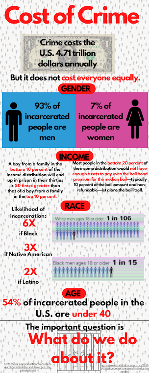
First, I spent some time thinking about what I wanted to portray and how I wanted to portray it. I knew the disproportionate statistics of incarceration were something striking, but I was trying to think of how to make the project about the cost of crime since that was my focus. I knew an infographic or video would be my method (video largely just due to my experience), but decided on an infographic since I don’t think moving image work is best for analytic display but more emotional display. I settled on an infographic as a way of portraying bold numbers and cutting statistics.
I thought an interesting idea would be to contrast the dollar cost of crime to the social cost of crime. I wanted the main form of visual imagery to be numbers and human bodies, or at least renditions of humans. In the infographic, you’ll notice the dominance of the human form with a series of numerical values depicting the realities of incarceration as a way of forcing a reminder that these numbers are describing people.
I chose a simple color palette to reinforce the boldness of an infographic. The black text is the filler/elaboration/clarification/completion, but the red is the power. There is a severity to these two colors that matches the severity of the toll of crime and incarceration.
In what ways did creating the visualization deepen your understanding of the topic in ways that reading alone might not have?
As stated before, I think this project allowed me to connect the ideas of my topic to a psychological power that reading alone does not hold. Colors, human body shapes, boldness and different composition allow an accentuation and sensationalizing that a paragraph of text can not.
I got to experience a different way of thinking about facts. What should be focused on? What visual tools would reinforce these concepts? How can I guide a reader? What structure should it take? I moved through these questions in my journey, so had to further my understanding of what mattered.
How has the process influenced your thinking on visualization as a vehicle for learning and/or how might you use visualization in your future teaching?
To be honest, I am not fully pleased with how this turned out. It looks amateurish. It took a lot longer than expected. It is not ideal.
I think the concepts contained in this project, my project and visualization are wonderful for expanding the ways we teach and share with our students, but I don’t think this will be a sustainable practice for me as a teacher. For most of the topics we will be covering in the social studies, something about any topic will exist and be much better than what I can produce in a timely manner.
I did find value in being able to depict exactly what I wanted to create based on my prior research, but this is not something I will likely pursue further. I have downloaded about 30 sample infographics that I used for guidance that I plan to use in classes in the future.
Where I do see using this is in turning it into an assignment. Having the students produce an alternate form of a research paper via visual medium sounds fantastic. It lets them follow the process we followed for this project, and their work would serve as wonderful hallway/classroom displays.

Hey Max,
ReplyDeleteWay to end on a high note! I can't believe you made this yourself. Your idea of contrasting fiscal cost with social cost is brilliant and well-executed. As I've said in my comments from the beginning, your topic is super interesting to me, and you crystallize very well in your infographic how the economic and societal elements of crime coalesce. What tool did you use to make the infographic? I do not think it looks amateurish at all. Nice work!
The program is call Canva! It was super intuitive and (mostly) free. Just have to pay to unlock certain features that didn't feel necessary.
DeleteHi Max!
ReplyDeleteI agree with Renee, I really do not think that your infographic looks amateurish at all!
I really like the use of shocking stats and contrasting colors, it helps us to focus on what is most important about the infographic. And I felt similarly when creating my video, this strategy really helps push us to consider what is the most important information to include.
I do agree that these projects can be difficult and time consuming, but there are probably ways that can be fixed or lessened. Perhaps having the research/outlining portion of an infographic project being included in or separate from the grade of the infographic could prevent students from receiving a bad grade because of the challenges presented by creating an infographic. Maybe creating a video tutorial of how to do certain things on the website that they will be creating it on, and also potentially giving them specific infographic templates to be using, rather than letting them pick.
Thanks for sharing!
Hi Max,
ReplyDeleteI think your visualization piece is great and it helped me personally bring all the information that you talked about together and I think it would defiantly help your students if you taught this in your class! I think it's a great idea to have this as an assignment. My students looovvveee creating things on canva or on paper and allowing them to show their learning in this way would probably go really well. I think Briesa brings up great points on how to structure the assignment to help students stay on target and make the task less daunting to them if they have never done something like this before. I know that I will be using what I learned from your blog in the future!
Hi Max!
ReplyDeleteI think your visual is amazing, especially considering the thought you put behind the color scheme and how it impacts the strength of your message. I loved looking at and reading your post. The comparison between the fiscal cost and the social cost was extremely interesting to read about and such an important topic. I think many people don't think much about it, so bringing this to attention was a great idea. I also think that the visuals within the graphic you made fit very well witht he topic and make it so much more influential. I can also see turning this into an assignment. In fact, my CT and I decided to have our student make a poster introducing a 28th Amendment as a part of their summative grade for out final unit this semester. You are definitely on to something! I really enjoyed seeing what you had to share!